
The Gap Between Instagram Journals and Journals People Actually Keep
Open a fresh Leuchtturm1917 dot grid notebook beside a new set of Tombow Dual Brush Pens, and a specific kind of paralysis sets in. You have seen the spreads — the perfect watercolour headers, the colour-coded weekly layouts, the washi tape borders executed in three perfectly complementary shades. Then you open to page one and do nothing, because anything you create will look worse than what you have seen online.
That is not a creativity problem. It is a framing problem.
Colourful journaling is not art. It is a system for capturing thought, memory, and intention — and colour is the organisational layer sitting on top of that system. The difference between a journal that survives three weeks and one that becomes a ten-year habit is almost never artistic skill. It is whether the method costs less mental effort than it returns.
The most effective colourful journalers work with three colours maximum per page. That sounds limiting. It is exactly why their spreads look cohesive rather than chaotic. Pick a dominant colour (roughly 60% of the visual space), an accent (30%), and a highlight for key emphasis (10%). Apply those proportions to headers, borders, and key terms. That is the complete system — no art degree, no hand-lettering practice required.
Colour in a journal earns its place when it does at least one of three things:
- Makes different entry types instantly distinguishable — work versus personal versus health logs stop blurring together when each has a consistent colour
- Creates visual landmarks so you can flip to a specific week in thirty seconds without reading every page
- Makes sitting down to write feel like something you chose rather than something you are obligated to complete
Research on colour and memory encoding supports this: colour contrast increases recall of associated information. That is not an argument for elaborate decoration — it is an argument for using colour with intention rather than at random. A Zebra Mildliner in Mild Blue and a black ballpoint get you most of the functional benefit. Everything else is optional and should stay optional until the habit is solid.
Supplies: What Earns Its Place vs. What Gets Sold to You
The journaling supply market is aggressively good at making you feel underprepared before you have started. A beginner can spend $80 before writing a single word — most of it unused within six months. Here is an honest breakdown:
| Supply | Best Product | Approx. Cost | Verdict |
|---|---|---|---|
| Dual-tip highlighter markers | Zebra Mildliner (15-colour pack) | $15 | Essential — the foundation of any colour system |
| Fineliner for borders and headers | Sakura Pigma Micron 05 | $3 | Essential — clean lines, waterproof, will not smear |
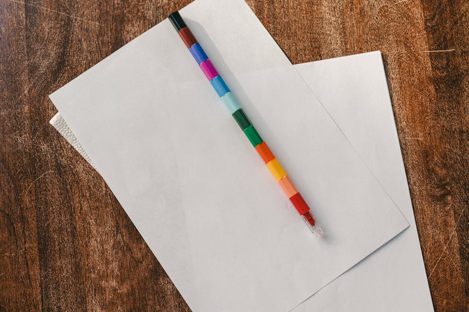
| Brush pens for large headers | Tombow Dual Brush Pens | $3–4 each | Useful, not essential — skip if budget is tight |
| Coloured gel pens for writing | Muji Gel Ink Pen set (10 colours) | $12 | Useful — enables colour-coded writing by entry type |
| Washi tape for page dividers | MT Tape 15mm assorted pack | $8–12 | Nice to have — functional first, decorative second |
| Highlighters for post-writing review | Stabilo Boss Original 6-pack | $7 | Useful — does not bleed through standard 80gsm paper |
| Watercolour pans | Winsor & Newton Cotman 12-pan | $18 | Skip unless painting is already a hobby — high skill floor |
| Sticker sets | Various brands | $5–15 | Skip — adds visual clutter, rarely improves function |
Notebook choice affects the whole system. Leuchtturm1917 A5 dot grid ($25) and Rhodia Goalbook ($22) both handle Mildliner ink cleanly on 80gsm paper without bleed-through. Standard Moleskine Classic notebooks bleed with anything wetter than a ballpoint — a real problem when your colour system depends on markers. Dingbats Earth notebooks ($15) perform comparably to Leuchtturm1917 at lower cost if the budget matters.
For a zero-waste start: Zebra Mildliner 15-colour pack ($15) plus Sakura Pigma Micron 05 ($3) plus a Staedtler Mars eraser ($2). That $20 kit handles every technique below. Buy more only after the habit is established — not before.
Six Colour Techniques That Require No Artistic Skill
Each of these works in under five minutes per page setup. None require a steady hand, calligraphy training, or artistic confidence. They are organisational tools that happen to use colour as their medium.
-
The traffic light system. Three colours, three fixed meanings. Red means urgent or action needed. Yellow means in progress or uncertain. Green means complete or positive. Apply this consistently across task lists, habit trackers, and goal reviews. You scan a page and know the status of everything without re-reading a word. The constraint — only three colours, fixed meanings — is what makes it useful. The moment you start improvising, it becomes noise.
-
Colour-blocked headers. Draw a filled rectangle behind your page title using a Mildliner. The rectangle does not need geometric precision — a slightly wavy edge reads as intentional, not careless. Ten seconds of work. Any page looks structured and navigable at a glance. This single technique accounts for most of what makes well-organised journals look well-organised. It is not the brush lettering that does it.
-
Washi tape as functional page dividers. MT Tape in 15mm width fits standard notebook margins cleanly. Run a strip along the outer edge of a recurring page type — weekly spread, monthly review, reading log. Use the same tape pattern for the same page type every time. After two months, flipping to your last weekly spread takes one second. That is the only reason washi tape belongs in a journal.
-
Colour-coded writing ink by entry type. Muji’s 10-colour gel pen set ($12) covers every category you would realistically need. Assign one colour to reflective journaling, a second to task lists, a third to things you heard from other people — quotes, advice, feedback. Flip back through two months and you can read the distribution of your attention in under a minute. That is information a plain text log cannot surface without active searching.
-
The monthly palette rule. On the first of each month, choose two Mildliner colours. Use only those two for all decorative elements — headers, borders, bullet markers — that month. No colour decisions needed mid-week. No visual fatigue from managing too many options. The notebook develops natural chapters, and you spend zero time each session deciding what to reach for.
-
Highlight after writing, not while writing. Write everything first in plain black ink. Then go back with a Stabilo Boss Original and mark the sentences that carry real weight — the insight, the decision, the thing you need to find again in three months. This separates the writing process from the editing process. Both improve when they are not happening simultaneously. Stabilo Boss does not bleed through standard 80gsm paper, which matters more than its colour range.
When Colour Works Against You
When the setup takes longer than the thinking, the journal dies. A weekly spread that requires 40 minutes of colour work before you write a word is not a journal — it is a craft project with text in it.
Build for the version of yourself with seven minutes and a tired brain. That person exists far more often than the version with a free Sunday afternoon, and they are the one who determines whether this habit survives past month two.
Colourful Page Ideas Worth Actually Trying
What does a functional colourful mood tracker look like?
The most maintainable version is a grid: rows for each day of the month, columns for each category you care about — energy, focus, social, physical, overall mood. Assign a Mildliner colour to each rating level. Mild Pink for good, Mild Yellow for neutral, Mild Gray for low. Fill in the corresponding cell each evening. The whole entry takes under two minutes daily.
At month-end, patterns appear without any deliberate analysis. Three weeks of Mild Gray in the focus column on Mondays is a data point worth acting on. A text-based mood log requires you to re-read every entry to surface that same pattern. The colour does the analytical work passively.
How do you make a colourful memory page without it becoming a scrapbook?
Keep it text-led and colour-accented. Write the memory first — what happened, one specific sensory detail, why it mattered. Then use a Tombow brush pen to colour the date and one key phrase in the entry. That is the full visual treatment. The colour marks it as significant; the words do the actual preserving.
If you want photographs included, a Fujifilm Instax Mini print (around $0.75 per print) taped in with a single strip of washi works cleanly without adding bulk. Do not let photo sourcing become a weekly production task that crowds out writing. Memory pages that take 45 minutes to assemble get skipped. Memory pages that take 8 minutes get done.
What is the fastest colourful weekly spread that still looks intentional?
Two pages. Left page: seven colour-blocked day headers — one filled rectangle plus the day name, about ten seconds each, done in under two minutes total. Right page: three sections using two Mildliner colours — this week’s single priority focus at the top, task list in the middle, open notes at the bottom. Total setup time: under eight minutes.
This structure mirrors the Rhodia Goalbook’s pre-printed weekly layout, which was designed based on how people actually use weekly planners. The difference is that your version flexes to however much space Monday actually needs, rather than forcing content into fixed printed cells.
Matching Your Colour Logic to How You Actually Think
The most common reason colour systems fail is that people copy someone else’s logic rather than building their own. The system has to reflect how your brain processes information — not how a particular journaler’s brain works on YouTube.
If you think in categories — work, health, relationships, finances — assign one Mildliner to each and apply it consistently across every page type. Use the same colour for work entries in your mood tracker, your weekly spread, and your goal log. After a few weeks, your brain reads colour before reading words. That is the efficiency gain you are building toward, and it only works if the colour-to-meaning mapping never changes.
If you think sequentially and time is the primary organising principle in your life, time-based colour works better. Past entries in one shade, current-day writing in a second, future planning in a third. Tombow Dual Brush Pens in Muted Sage, Muted Mauve, and Muted Blue create a readable timeline without competing with the text — they are distinct enough to tell apart, subtle enough not to dominate the page.
If you resist systems and want colour to make pages feel alive without adding overhead, the monthly palette approach is the lowest-friction option. Two Mildliners, no rules, one month at a time. Enough structure for visual consistency, not enough to feel like a constraint you will eventually resent and abandon.
The one approach that reliably fails: applying colour randomly with no repeating logic. Random colour is visual noise. The entire point of colour in a journal is accelerated pattern recognition — the brain processes colour faster than it processes text, so if the colour carries no consistent information, you have added visual complexity without adding any navigational value.
Choose one logic, apply it for thirty days, then assess honestly. Thirty days is enough to know whether the colour system is working for you. It is not enough time to evaluate whether journaling itself is working — that takes longer, and is a separate question with a separate answer.
A colourful journal you open every day beats a perfect journal that stays closed.