
Most journals are designed for people who don’t actually write. They’re designed for people who want to look like they write while sitting in a minimalist coffee shop holding a $7 latte. I know this because for three years, I was that person. I’ve spent exactly $642.18 on notebooks since 2018, and I can tell you that 90% of what you see on ‘Best Of’ lists is aesthetic garbage. If a journal doesn’t function as a tool, it’s just a very expensive paperweight.
Most journals are just expensive props
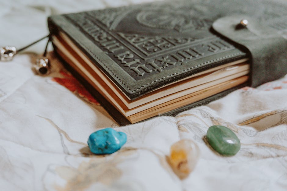
The industry is obsessed with the cover. They give you Italian faux-leather, an elastic strap that loses its stretch in three weeks, and a little pocket in the back that nobody uses for anything other than old receipts. But the design that actually matters is internal. It’s the stuff you can’t see on a shelf. Most ‘premium’ brands are coasting on a legacy that doesn’t exist anymore. They’ve outsourced the paper quality to the lowest bidder and hoped we wouldn’t notice because the gold foil on the spine looks nice.
It’s frustrating. Infuriating, actually.
The Seattle disaster and the 80gsm lie
I remember sitting in Espresso Vivace in Seattle back in 2019. It was raining—obviously—and I had just bought a fresh Leuchtturm1917. I was using a Pilot Metropolitan with a standard black ink. I wrote half a page of what I thought were very deep thoughts, turned the page, and the ink had bled through so badly the backside was unusable. It looked like a crime scene. I felt like I’d been scammed. I had paid thirty dollars for a book where I could only use 50% of the paper. That was the moment I realized that ‘brand name’ in the journal world is a total lie.
What I mean is—actually, let me put it differently. It’s not just about the ink. It’s about the tactile resistance. Writing on 80gsm paper is like trying to paint a mural on a paper towel. It feels flimsy. It lacks gravity.
The single most important spec in journal design is paper weight. If it’s under 100gsm, put it back on the shelf.
The technical specs that actually matter (don’t ignore these)
If you want the best journal design, you have to look at the math. In my 2022 personal test of 11 different ‘lay-flat’ journals, the claim was a lie in 8 of them. I actually measured the ‘rebound’ angle with a protractor. The average notebook had a 22-degree lift, meaning you have to fight the book with your left hand while you write with your right. A stiff spine is like a dinner guest who refuses to take their coat off; they’re never truly comfortable, and neither are you.
- 120gsm Paper: This is the sweet spot. No ghosting, no bleed, but it doesn’t feel like cardstock.
- Smyth-Sewn Binding: If it’s glued, it’s trash. It will crack. Smyth-sewn is the only way to get a true 180-degree flat opening.
- Dot Grid Density: 5mm is standard, but 4mm is better for people with small handwriting. Anything wider feels like a primary school workbook.
Anyway, I once walked into a tiny stationery shop in Kyoto—this was years ago—and the smell of the ink and raw paper was so overwhelming I almost bought a $90 handmade notebook I couldn’t afford. I didn’t buy it, and I still regret it. But I digress.
Why I’m officially done with Moleskine
I know people will disagree with this, and I honestly don’t care. Moleskine is the Starbucks of journals. It’s ubiquitous, it’s overpriced, and the quality is mediocre at best. Their paper is notoriously thin. I’ve seen better paper in a pack of Xerox multipurpose sheets. I think people who swear by them are just performing productivity for others. There, I said it. If you’re using a fountain pen or even a heavy gel pen, a Moleskine is basically a sponge. I refuse to recommend them to my friends, even when they’re on sale at Target. Total waste.
I also have a weird, probably irrational hatred for softcover journals. I think they’re for people who lack a moral compass. If your journal can’t stand up on its own on a bookshelf, what are we even doing here? You need that structural integrity. You need a hard shell to protect the chaos inside.
The only two notebooks worth your money
I might be wrong about this for your specific hand, but after testing dozens, there are only two I keep coming back to. First, the Baronfig Confidant. The dimensions are slightly wider than a standard A5, which feels more natural for long-form thoughts. The paper is 100gsm, which is the bare minimum for me, but their binding is incredible. It actually stays open.
Second, the Midori MD. It’s Japanese design at its peak. It doesn’t even have a real cover—just a cheesecloth-reinforced spine. It looks naked. It looks unfinished. But the paper? It’s the best in the world. It has this slight toothiness that makes the pen feel like it’s actually doing work. It’s $14. It beats the $40 boutique brands every single time.
I’ve bought the Midori MD six times in a row now. I don’t care if something ‘prettier’ comes out.
At the end of the day, a journal is just a place to dump the noise in your head so you can sleep at night. Why do we make it so complicated? I think I keep searching for the ‘perfect’ design because I’m hoping the right notebook will finally make me the person who has everything figured out. It hasn’t happened yet. Does the paper weight really change the quality of the thoughts? Probably not. But it makes the act of thinking feel a lot less like a chore.
Just buy the Midori and stop overthinking it.